
Project Title: Innovators & Entrepreneurs Foundation Rebranding
Client Name: Innovators & Entrepreneurs Foundation
Date: 2020-2023
Role: Graphic Designer
Context
In 2020, the Innovators & Entrepreneurs Foundation (IEF) underwent a significant update to its branding. However, with the Foundation hesitant to launch the rebrand, I took it upon myself to initiate a personal project aimed at addressing some key branding challenges.
Reasons for the Rebrand
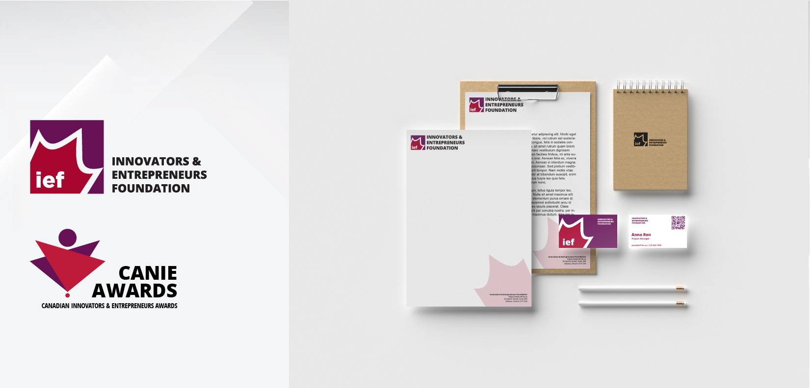
There were two primary motivations behind this rebranding endeavor. Firstly, the Foundation and the CANIE Awards shared the same logo, leading to potential confusion among stakeholders. By introducing distinct logos for each entity, clarity and brand recognition could be enhanced. Secondly, over time, the existing logo caused confusion, with some mistaking the maple leaf symbol for an “M.” This ambiguity prompted the need for a rebrand to alleviate confusion and ensure the logo accurately represented the Foundation’s identity.
Project Initiation and Conceptualization
Delving into the Foundation’s history, I identified reasons for the branding confusion and embarked on a meticulous process of conceptualizing and finalizing the rebranding project over several months. This involved careful consideration of color selection, logo design, and overall brand identity.
Logo Design and Symbolism
For the Foundation logo, I retained the square shape but introduced new colors – deep red and purple – to symbolize Canada’s richness and the qualities essential for small and medium-sized businesses. Adjustments to the maple leaf angle were made to clarify its shape and eliminate any confusion with the letter “M.” Additionally, the shortened name “IEF” was incorporated into the logo for ease of recognition. Similarly, the CANIE Awards logo underwent a transformation, incorporating triangles and circles to form a maple leaf shape while reinforcing the organization’s full name below the logo.
Implementation and Impact
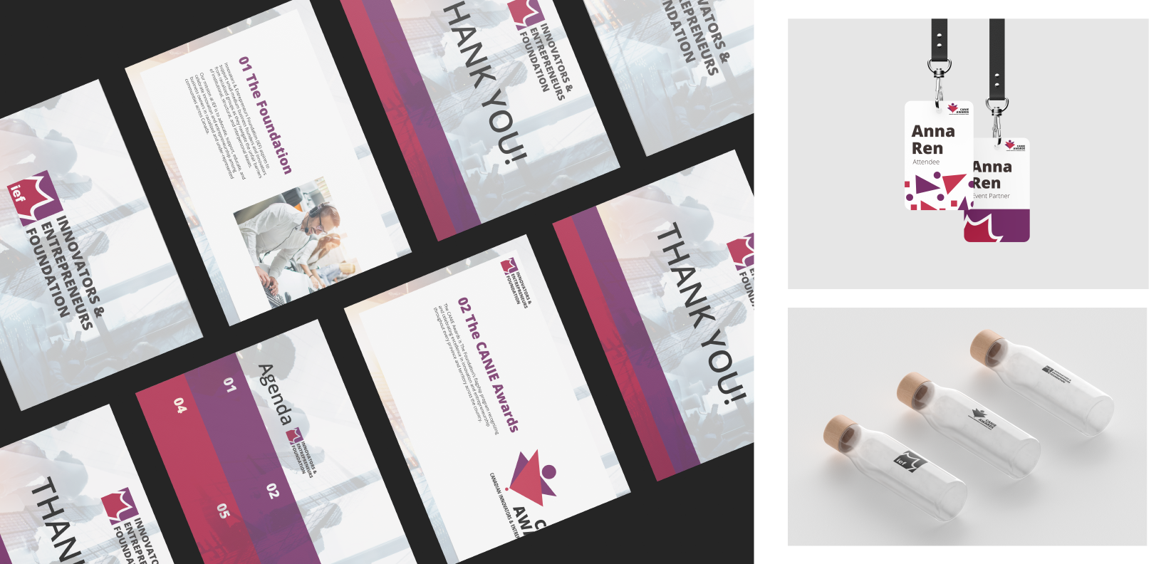
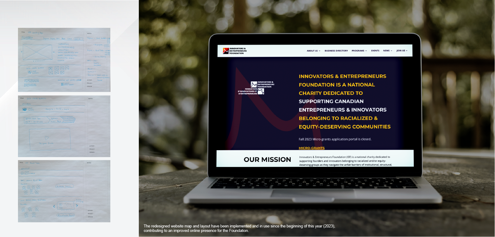
The rebranding effort extended beyond logo design to include redesigned business cards, PowerPoint templates, and letterheads. Despite not receiving approval from the Foundation CEO due to the brand’s recent update, elements of the rebrand, such as the revised maple leaf angle, found their way into various designs in 2023, contributing to a more cohesive and visually appealing brand identity.
Conclusion
While the rebranding project may have originated as a personal endeavor, its impact on clarifying brand identity and addressing key challenges within the Innovators & Entrepreneurs Foundation cannot be understated. By carefully considering symbolism, design elements, and stakeholder feedback, the rebranding initiative serves as a testament to the Foundation’s commitment to clarity and excellence in branding.
